How to Create a Sophisticated Neutral Interior
Mastering the neutral palette is the ultimate test of an interior designer. Discover how to layer subtle shades of ivory, sand, and stone with rich tactile depth.
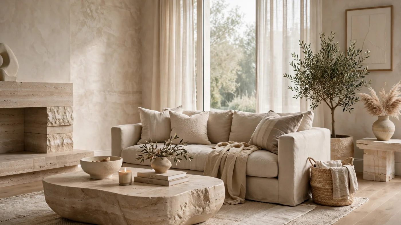
Mastering the sophisticated neutral interior is the ultimate designer flex: with no bold color to hide behind, tone, texture, and light must do all the work. Done well, neutrals feel warm, layered, and endlessly calming; done poorly, they fall flat and cold. This guide breaks down the exact decisions — undertone, texture, contrast, and styling — that separate a forgettable beige box from a truly refined neutral home.
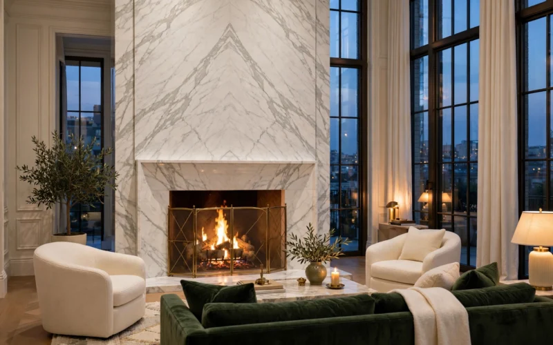
A sophisticated neutral interior is the epitome of quiet luxury. Far from being sterile or monotone, a well-executed neutral scheme is a layered symphony of subtle tones, tactile organic textures, and dynamic interplay with natural light.
Decoding Undertones: Warm Ivory vs. Cool Greige
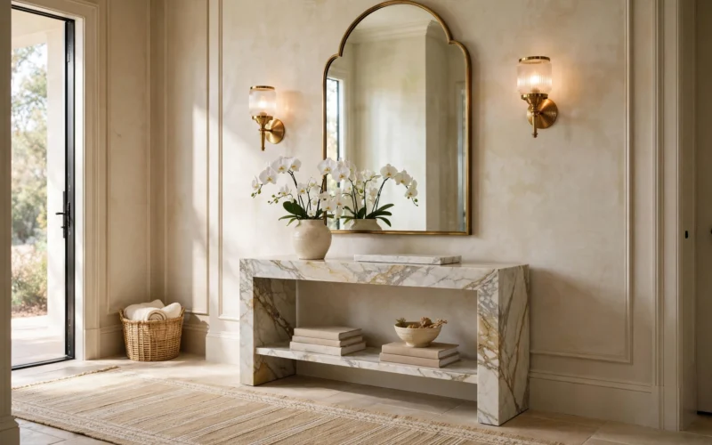
The secret to avoiding a lifeless neutral room lies in understanding undertones. Sterile stark whites reflect daylight harshly, whereas warm ivory, bone, pale parchment, and creamy travertine contain minute traces of yellow, ochre, and umber that soften daylight into a comforting embrace.
When selecting architectural paints, test large brush-out boards against both morning eastern sunlight and warm afternoon western rays. Pair subtle wall washes (such as Roman clay or lime wash) with slightly deeper trim finishes to introduce gentle architectural definition without breaking chromatic harmony.
Texture as the Primary Accent
When saturated pigments are omitted, texture must perform the work of color. A flat-weave wool rug paired with a slick lacquered cocktail table and a nubby bouclé daybed creates a stimulating tactile dialog. The brain registers these textural shifts as varied visual weight, preventing the room from reading as flat.
- Textile Layering: Combine heavy slubbed Belgian linen drapery, sheared shearling accent pillows, and unspun merino wool throws.
- Hard Surfaces: Contrast honed matte limestone flooring with wire-brushed cerused oak millwork and patinated bronze fixtures.
The 10% Contrast Accent Rule
Every neutral sanctuary requires approximately 10% grounding contrast—often termed the ‘black anchor.’ A blackened steel window frame, charcoal bronze side table, or dark walnut bookshelf provides visual ballast that prevents neutral tones from floating away.
Botanicals and Living Organic Elements
In a monochromatic home, nature becomes the most potent decorative flourish. A single sculptural olive tree in an aged Tuscan terra-cotta vessel or an architectural arrangement of dried Japanese magnolia branches brings organic silhouette and life into a neutral space without disrupting the serene palette.
Conclusion
Designing with neutrals requires confidence, patience, and meticulous material curation. When executed with precision, the result is a timeless, restorative sanctuary that offers respite from the sensory overload of modern urban life.
Building Your Neutral Palette: A Room-by-Room Formula
Start with one unifying wall color carried through the main living spaces — a warm ivory or pale greige — then let each room deepen or lighten from there. Bedrooms can go a shade deeper for cocooning comfort; kitchens and baths lift a half-shade brighter for freshness. This gentle gradient creates flow without monotony.
Assign each room a signature material to avoid repetition: limestone in the entry, cerused oak in the study, bouclé in the living room, washed linen in the bedroom. The palette stays neutral while every space keeps its own identity — the hallmark of a sophisticated neutral interior that feels designed, not decorated by default.
Sophisticated Neutral Interior Lighting: Warmth Is Everything
Neutrals live or die by light quality. Banish daylight-white bulbs: at 4000K and above, warm ivory walls turn gray and flat. Specify 2700K throughout, put every circuit on a dimmer, and layer at least three sources per room so raking light reveals textural depth.
Maximize natural light as the primary material. Sheer linen panels diffuse harsh sun into a soft glow, and well-placed mirrors bounce daylight into shadowed corners. This attention to light is what makes a sophisticated neutral interior glow rather than merely exist.
Art and Accessories in a Sophisticated Neutral Interior
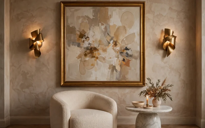
In a neutral scheme, art carries unusual responsibility. Choose pieces with strong texture or subtle tonal movement — plaster reliefs, charcoal drawings, sepia photography, woven wall hangings — rather than competing color. One oversized quiet piece anchors a room better than a busy gallery wall.
Style surfaces with a restrained material story: handmade ceramics, travertine boxes, linen-bound books, a single branch in a stone vase. This quiet styling echoes the Japanese philosophy of wabi-sabi — beauty in imperfection and restraint — the spiritual home of the sophisticated neutral interior.
Mistakes That Make Neutrals Feel Dull
The number one killer is a single flat tone everywhere — walls, sofa, rug, and curtains in identical beige reads as a void. You need four or five distinct tonal steps plus real contrast: the dark bronze, the blackened steel, the deep walnut that grounds everything. A sophisticated neutral interior forgives many sins, but flatness is not one of them.
Second: ignoring undertones when mixing whites. A pink-beige sofa against yellow-cream walls will always look dirty — keep undertones in one family and test combinations in your actual light. Third: forgetting pattern entirely. A subtle stripe or quiet geometric keeps neutrals from feeling institutional.
Sophisticated Neutral Interior: Frequently Asked Questions
Will a neutral interior feel cold or boring?
Only without texture and contrast. Layer five tactile materials, add the 10% dark anchor, and include something living — neutrals styled this way feel warm and interesting, never sterile.
How do I keep a neutral home from looking dated?
Stick to timeless materials — stone, oak, linen, wool, bronze — and avoid trendy beige-gray hybrids tied to a decade. Classic neutrals with honest materials age gracefully.
Can I add color to a sophisticated neutral interior?
Yes — through nature and art. Olive trees, eucalyptus stems, and landscape art introduce greens and earth tones that shift seasonally without committing the architecture to any color.
What is the best white paint for a sophisticated neutral interior?
There is no universal answer — it depends on your light. Warm south-facing rooms suit softer whites; cool north-facing rooms need whites with visible warmth to avoid going blue-gray. Always test large boards in situ.